Why Your App Marketing Strategy Should Include a Web Acquisition Funnel

Eugene Strelets is a mobile growth and product manager with over four years of experience in data-driven experimentation. With a deep focus on driving mobile products to the next level of scale and profitability, Eugene has tested growth experiments and performance funnels at major consumer subscription app publishers like Gismart, Loona, and weight loss app, Able.
For Braavo Office Hours, Eugene sat with us to discuss web acquisition funnels, the latest app marketing strategy that’s changed the game for marketers across the industry. Not sure what a web funnel is — or curious how to improve yours? This article dives into our discussion and offers high-level insights about how to start or advance your web acquisition strategy.
Why a web funnel matters for apps right now
“There are two big problems for apps on the App Store and Play Store today,” Eugene explains. “First, there are limitations around user privacy and identification. After Apple rolled out SKAd Network, acquiring users has become more challenging because you don’t have tracking transparency, and you can only optimize with broad targeting.” For many app developers, this has led to higher acquisition costs that have threatened profitability, and it’s also made it challenging to measure campaign performance accurately. “It’s become a big problem for a lot of publishers now,” Eugene says.
The second problem, as we all know too well, is the App Store’s commission. “Unless you’re part of the small business program, which reduces the commission by 15%, you have to pay Apple and Google 30% of your revenues,” Eugene explains. For years, developers have tried to claw back this enormous chunk of revenue they never get to see, even taking Apple to court in some cases, with many resorting to creative ways to skirt the commission altogether. Eugene points to successful subscription app businesses like Noom, considered by some as a pioneer in creating a new approach that’s led to massive growth for the company in just a few years. With many big publishers and smaller developers following their lead, the web funnel has exploded as an acquisition channel that ultimately helps improve profitability and marketing effectiveness.
What is a web acquisition funnel?
Streaming services like Spotify and Netflix have long managed to avoid the App Store’s commission fee. Because their product extends beyond the mobile experience alone, these companies have designed a journey for their subscribers to sign up through their website instead of subscribing through their app.
For consumer subscription apps, however, like those designed for fitness, meditation, learning, or other content-driven purposes, it hasn’t been so simple. With limitations around the types of apps that can offer alternative subscription methods, and with iOS restricting developers from redirecting users to any web purchase, developers have latched onto what appears to be a grey area opportunity. Instead, app marketers and developers are acquiring their subscribers through a web experience first — before the user ever enters the app. For marketers, this means an exciting new challenge that involves articulating the value of your product before someone installs your app or logs in; for developers, this strategy means close to 100% of the subscription proceeds go back into your business.
A web acquisition funnel looks a bit like this (with lots of variations):
- a user is targeted with an ad for your app
- they click on the ad which brings them to a branded webpage
- the webpage might ask the user a series of questions related to your app (what is also known as an onboarding funnel or questionnaire)
- the webpage also asks for the user’s email address, or some other way to contact them
- at the end of the page, the user is asked if they would like to buy a subscription to the app, typically at a discounted rate or on a trial
If the web funnel is successful, the targeted user has become a paying subscriber without ever opening your app, and the proceeds from the auto-renewing subscription are not subject to Apple’s 30% commission. Even if the funnel doesn’t convert a subscriber but successfully captures their contact information, you now have a valuable opportunity for retargeting and converting them later on.
As app marketers and developers have seen over the last few years, A/B testing and experimenting with an app’s onboarding funnel has fundamentally changed how apps successfully convert new subscribers. Similarly, the web acquisition funnel is a new layer that has so much potential, the industry is seeing entire product and UA teams built around the strategy. And, similar to tweaking the in-app user experience, these teams are constantly experimenting and optimizing their web funnel — through testing different prices, subscription durations, payment method, questions, page design, creatives, ad copy, and so much more.
Turning a web subscriber into an app user — how exactly?
One of the most obvious challenges with acquiring a subscriber on the web before they’ve ever installed your app is that they still need to install your app. If they don’t, you’re risking high churn with your web subscribers, a factor that could be detrimental to subscriber LTV and the profitability of your campaigns. Not only does the subscriber need to be aware they’ve just purchased an app, they need to know how to download it — and reducing this friction by building it right into the experience is an important element to a successful web funnel.
Eugene explains this can be resolved with clear instructions on the checkout page, along with a transactional email after purchase detailing next steps for installing the app. But he also says this isn’t fool proof. “It’s unrealistic to expect one hundred percent of these subscribers will go and download the app, which is also why having customer support is so important for web subscriptions,” he explains. “Customer support should be there to help users with issues related to downloading, refunds, billing, and other issues that are normally provided by Apple’s infrastructure.”
While this may sound like a lot of work — and it is — it’s important to view this support communication layer as an opportunity to talk to your users, send a promotional offer, or win back churned subscribers. “By having this immediate customer support interaction, you can identify any technical issues with your product very quickly or get feedback about features. It can be hard to communicate with your users directly otherwise,” Eugene explains. “You can also provide win-back campaigns, promo codes, trial extensions, or even information on how to use the product and ways to get more value from it.” Articulating this up front and early on with your web subscribers could make a significant difference in how successful your funnel turns out to be.
Communicating your app’s value throughout the entire funnel is also an important component to converting the web subscriber into a user. Compared to a brief in-app onboarding experience, where a new user judges your app immediately before deciding whether or not to stay, acquiring a user through a web funnel experience involves immersing the user in your app’s value at every moment. For example, using creative copy and branded UI, your web funnel might ask the user a series of questions about their goals and desires, and communicate why your product can help them be achieved. “Users who come to your app from a web funnel should already be warmed up, because they might have gone through a questionnaire and have had a lot more engagement with your brand before downloading the app,” Eugene explains. “So once they do download it, they should be ready to use your app right away.”
How to welcome users to your web funnel
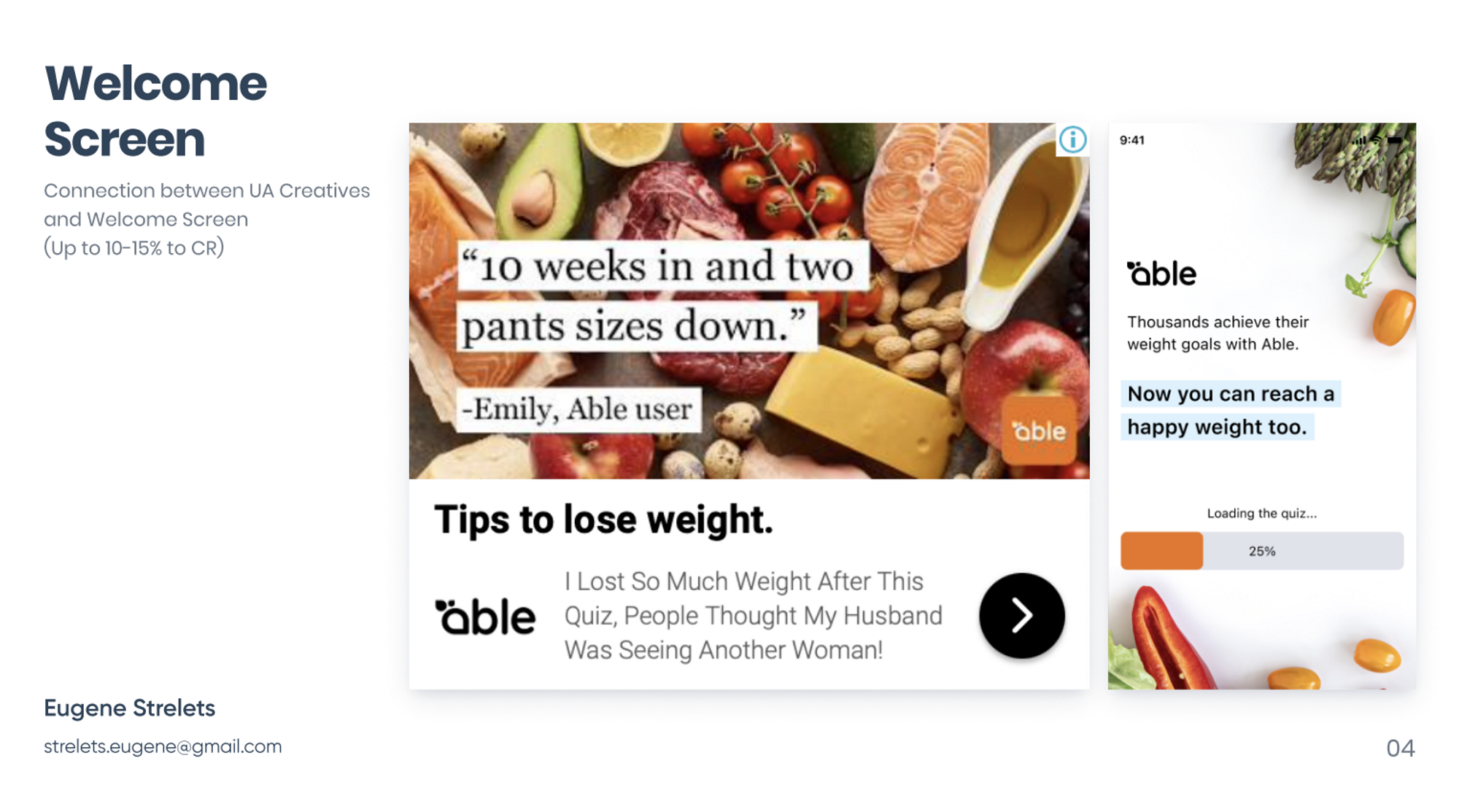
Some of the biggest app publishers in the world are actively running web acquisition funnels you can learn from right now. BetterMe, for example, has a web funnel for their 28-day workout challenge, which prompts users to join in, followed by a webpage that leads you through a long questionnaire. Eugene explains that testing the performance of that first click to the welcome screen is one area for experimentation, where you can try many different combinations to see which performs the best. Here are two examples:


Other experiments for this part of the web UA funnel include:
- static vs. video ad creatives
- changing the ad copy and titles
- branding and UI of the welcome page
- illustrations and animations (eg. loading symbol)
- user reviews or quotes
Reinforcing trust with your brand and product
While your web funnel is introducing your target audience to your app for the first time, it’s important to articulate what your product does, how it works, and include any social proof or positive user reviews that will reinforce this information. For example, a fitness app may want to include how much weight one person was able to lose while using their program, or a meditation app might want to highlight how many meditation sounds and sessions are included in the subscription.

Other ways to reinforce trust in your brand at this stage of the funnel could include:
- positive user reviews
- before and after images
- a list of features
- press mentions or “as seen in” logos
- progress stats you can expect from using the product
Guiding users through a questionnaire
Similar to in-app onboarding, including a series of questions in your web acquisition funnel will slowly build user engagement with your brand and product up front, and it will help users learn about the value your app provides. It will also give you an opportunity to learn about your audience, your targeting efforts, and how your funnel is performing. “It’s kind of a win-win situation because users become more engaged and you get to learn more about them, connecting these details later on in their experience,” Eugene explains.

Eugene also mentions that the way an onboarding quiz or questionnaire works to engage users is not a new concept — think how Buzzfeed paved the way for that years ago. “All of these different types of quizzes… users really love it,” he says. “Users want these kinds of interesting facts or want to get to know themselves better, because everybody is curious about human behavior.”
Information to gather during the questionnaire stage of the web funnel:
- gender, age, profession
- any current goals, needs, or challenges
- daily habits and behaviors
- personality traits
- preferences
- personalization data, like their first name
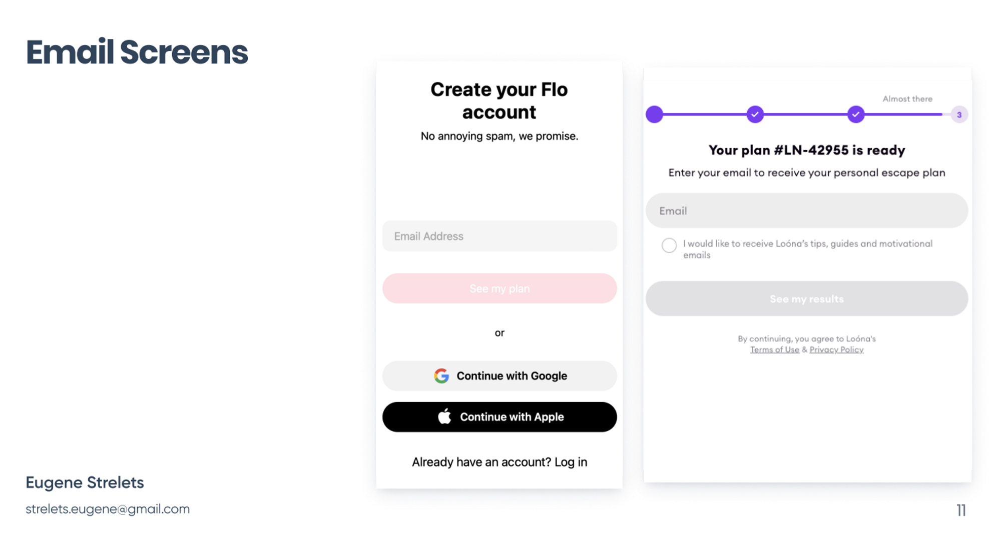
How to capture a user’s email in the web funnel
Unlike an app that logically requires an email to login, a web funnel that asks for a user’s email address might cause them to drop off if not thoughtfully placed at the right part of the journey. For example, a user may not want to provide their email address immediately, but might feel warmed up to it after answering a few questions and getting a sense of how your product might help them. In Noom’s case, their onboarding questionnaire involves more than a dozen questions that asks a user about their fitness habits. By the time Noom asks for your email address, you feel compelled to share it, because you believe that your information will be used to create a customized plan for your needs.
Depending on the information you want to collect, the design of your web funnel, and many other factors you’re trying to test, the point at which it feels right to ask users to enter their email address will vary. There’s no one-size-fits-all solution here — experimentation is key.

Other ways to experiment with capturing email in your web funnel:
- ask for their email in exchange for a plan or report
- ask for their email to unlock a result
- ask for their email to send a promotional offer
- ask for their email to create an account
How to create a successful checkout experience in a web funnel
Ah, the paywall — every app developer and marketer knows this is a critical part of the app funnel to drive success. Of course, the product experience, features, UI, and overall value matter immensely, but the paywall design can also provide a significant lift (or drop) in your conversions. Just think about it: a user loves your app but finds your paywall is tricky to navigate — that alone could mean one less subscriber.
Similar to an in-app paywall experience, the payments page on a web funnel requires tons of experimentation with design, copy, pricing, subscription durations, trial offers, promotional content, user reviews, and a variety of other elements. The paywall should absolutely reiterate your product’s value and benefits, along with key details about the subscription price and how it renews. But, again, there’s no one-size-fits-all solution, and some of the best performing web funnels are out there for you to test and learn from.

Another benefit of a web acquisition funnel is that your checkout can include a variety of different payment methods that may be more aligned with your target audience. For example, Paypal is often used in web checkouts, and you can even try using split payment methods like Klarna to capture an annual subscription spread out over 12 months.
Other ways to experiment with your web checkout:
- offer a “choose your trial” price
- bundled plans
- different subscription durations
- promotional pricing
- a variety of payment methods and currencies
- positive user reviews
- a glimpse at the in-app experience
Your web acquisition strategy should be designed for continuous learning
If there’s one thing that a web acquisition funnel should leave you with — it’s knowledge. A successful web funnel might lead to more subscribers at a more profitable level, allowing you to use those additional profits to improve your product and marketing efforts. But whether or not that happens, you should consider your web funnel an opportunity to collect critical information about your audience — their needs, goals, hopes, and desires — providing you with a clearer picture of how your product can help them be achieved. It’s even possible to consider a web acquisition funnel as an investment in customer research; when compared to an app install campaign, a web acquisition campaign lets you capture valuable details about your audience without the friction of downloading your app or logging in.
Do you have questions about how to implement a web acquisition strategy for your subscription app? Get in touch with our team to find out how we can help.


